

First — Let Me Save You Weeks of Guesswork
I’ve watched hundreds of new writers get this wrong. Not because they’re careless. Because nobody shows them what a real manuscript page actually looks like.
People overcomplicate it. Fancy fonts. Creative spacing. Decorative chapter titles.
Editors hate that.
A manuscript is supposed to be boring. Predictable. Easy on the eyes.
Why? Because the editor isn’t judging your formatting. They’re judging your story. Bad formatting just makes their job harder.
The gold standard is simple: 12-point Times New Roman, double-spaced, one-inch margins.
That’s it. Most manuscripts I’ve edited over 25 years follow exactly that.
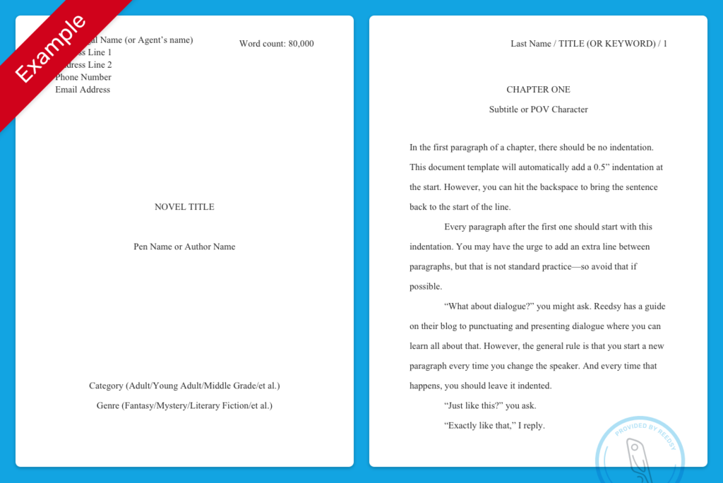
Let me show you what the page actually looks like.
A Real Manuscript Format Example (What Editors Expect)
Here’s the layout used by nearly every publisher and literary agent.
Your Name
Address
City, State ZIP
Phone NumberWord Count: 82,000TITLE OF YOUR BOOK
by Your NameChapter 1 The rain started just after midnight. It wasn’t the gentle kind either. The kind that taps politely on
windows and disappears before morning. This rain came down like it
had something to prove. Sarah stood at the kitchen sink watching the streetlights blur.
Something about the storm felt wrong.
Looks plain, right?
Good. That’s exactly the point.
The Five Formatting Rules Editors Expect (No Exceptions)
These are the things assistants check in the first five seconds.
Break one and you instantly look inexperienced.
Use these rules every time:
• Font: Times New Roman
• Font size: 12 pt
• Spacing: Double spaced
• Margins: 1 inch on all sides
• Alignment: Left aligned (not justified)
One more thing most people forget.
Indent every paragraph by 0.5 inches.
Don’t hit space five times. Use the paragraph indent setting in Word or Google Docs.
The Header Everyone Forgets
This is the tiny detail that separates beginners from professionals.
Every page needs a header.
Top right corner.
Format looks like this:
YourLastName / BookTitle / 23
Meaning:
| Part | Example | Why It Matters |
|---|---|---|
| Author Last Name | Smith | Pages stay identifiable if printed |
| Short Title | Dark Winter | Helps editors organize stacks |
| Page Number | 23 | Obvious, but crucial |
If pages get shuffled — and they often do — editors can put them back together in seconds.
Without the header? Chaos.
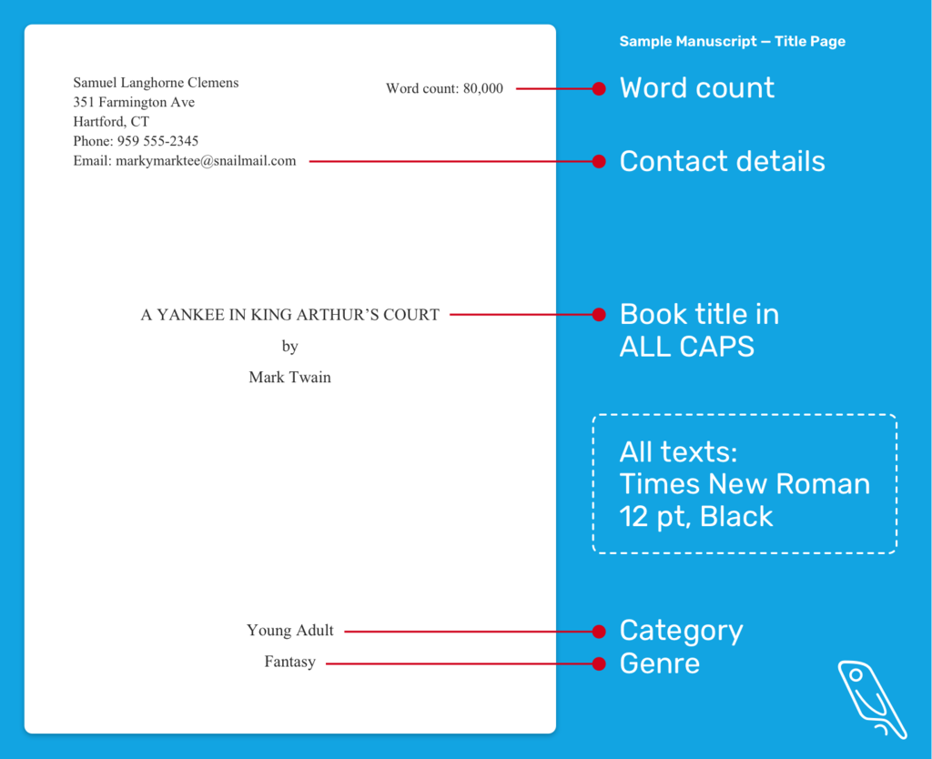
The Title Page Layout (People Always Overdo This)
The title page should not look like a movie poster.
Keep it clean.
Your Name
Phone NumberWORD COUNT: 82,000THE SILENT HARBORA Novelby
Your Name
No fancy fonts.
No centered poetry.
No quotes from Shakespeare.
Just information.
Dialogue Formatting (This Trips Up New Writers)
A surprising number of manuscripts get rejected because dialogue looks like a text message thread.
Wrong:
"Where are you?" she asked. "I waited all night."
Right:
"Where are you?" she asked."I waited all night."
Every new speaker gets a new paragraph.
This keeps the page readable when dialogue starts flying.
Editors scan dialogue quickly. Messy formatting slows them down.
The One Thing New Writers Do That Instantly Annoys Editors
Extra spacing between paragraphs.
It usually happens when someone writes in Google Docs or Word and presses Enter twice.
That creates this:
Paragraph text here.Paragraph text here.
But manuscripts should look like this:
Paragraph text here.
    Paragraph text here.
Indent. Don’t add blank lines.
Think of it like a printed novel page.
Microsoft Word Setup (The 30-Second Fix)
If you want your document correct instantly, do this:
- Open your manuscript
- Press Ctrl + A (select everything)
- Set font to Times New Roman
- Set size to 12
- Click Line Spacing → Double
- Set First Line Indent: 0.5 inch
Done.
You’ve just matched 95% of published manuscript submissions.
Google Docs Setup (Almost Identical)
Writers using Docs usually miss one setting.
Here’s the quick setup:
• Font → Times New Roman
• Size → 12
• Format → Line spacing → Double
• Format → Align → Left
• Format → Paragraph → Indent first line 0.5
And check this:
Make sure “Add space between paragraphs” is OFF.
That one checkbox ruins a lot of manuscripts.
The Weird Edge Case I See Every Year
Someone sends a manuscript with justified text.
Looks nice. Clean edges.
But publishers hate it.
Why?
Justification creates strange spacing between words. Editors mark up manuscripts constantly. That uneven spacing makes it harder.
Always use left alignment.
Novels get justified during the typesetting stage — not before.
When Formatting Actually Matters Less
Here’s something beginners worry about too much.
Agents care more about story clarity than perfect formatting.
If your manuscript is readable and follows the standard rules above, you’re fine.
Where formatting really matters is when:
• Submitting to traditional publishers
• Entering writing contests
• Sending work to literary agents
Self-publishing? The manuscript gets reformatted later anyway.
Quick Visual Checklist Before You Submit
Scan your document quickly.
If these look right, you’re safe.
| Element | Correct Setting |
|---|---|
| Font | Times New Roman |
| Size | 12 pt |
| Spacing | Double |
| Margins | 1 inch |
| Alignment | Left |
| Paragraphs | First line indent |
| Header | Name / Title / Page |
Nothing fancy. No creativity needed.
That’s the secret.
The Truth Most Writing Guides Don’t Tell You
Formatting isn’t there to impress anyone.
It exists so editors can read fast without friction.
Think of it like turning in a school exam on lined paper instead of scribbling on a napkin.
Same answers. Different reaction.
Use the standard format once and you’ll never think about it again.
The story takes center stage.
Exactly where it belongs.
If you want, I can also show you:
• A downloadable manuscript template (Word + Google Docs)
• A full novel manuscript example with chapter formatting
• The exact format literary agents request in submissions
Most writers find those even more helpful.