
Yeah… I’ve seen this exact frustration a thousand times.
You spend hours drawing a “nice” cover, upload it to Amazon KDP, and… nothing. No clicks. No sales. You start thinking maybe your art sucks.
It’s not your art.
It’s that you’re drawing the wrong type of cover.
There’s a difference between good art and a cover that sells. And most people never figure that out.
Let’s fix that.
The #1 Reason Your Drawn Covers Don’t Sell
Most beginners draw what looks cool.
Buyers don’t care.
They’re scanning tiny thumbnails on mobile. Half a second. Maybe less.
If your cover doesn’t instantly scream:
- what the book is
- who it’s for
- and what feeling they’ll get
…it’s invisible.
Your job isn’t to impress. It’s to signal.
That’s the whole game.
What Actually Sells on KDP (From Real Data, Not Guessing)
After years of testing covers across niches, the winners always follow the same patterns:
- Big, simple subject (one focal point)
- High contrast (dark vs light)
- Readable at thumbnail size
- Emotion or promise in one glance
Anything detailed, complex, “artsy”? Dead.
Low Content Covers That Sell (You Can Draw These Fast)
These are the bread-and-butter KDP money makers.
Minimalist Quote Covers (They Convert Like Crazy)


What works:
- Bold hand-lettered quote
- Solid background (black, beige, pastel)
- One accent element (line, star, underline)
Examples:
- “Just Start”
- “Plan Your Life”
- “My Daily Journal”
Don’t overdecorate. One font + one idea. That’s it.
Cute Character Covers (Kids + Niches = Money)


This works insanely well in:
- Kids notebooks
- Animal lovers
- Girly aesthetic journals
What to draw:
- One centered character (cat, bear, bunny)
- Big eyes, simple shapes
- Soft colors
If it looks like a sticker, it sells.
Pattern-Based Covers (Lazy But Profitable)


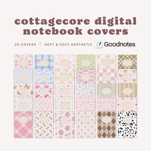
This is where beginners win fast.
Draw:
- 1–3 simple elements (hearts, flowers, stars)
- Repeat them
Done.
Why it works:
- Clean
- Recognizable
- Looks “premium” even when simple
Medium Content Covers (Higher Profit, Slightly More Effort)
Now we step up.
Activity Book Covers (These Print Money If Done Right)


Key rule:
The cover must SHOW the activity.
Not hint. Show.
- Maze → draw a maze
- Coloring → show black outline art
- Word search → include letter grid
Parents decide in seconds.
Niche-Specific Covers (This Is Where Real Money Starts)
Examples that actually sell:
- Gym logbook → dumbbell sketch
- Recipe journal → hand-drawn food
- Budget planner → money icons
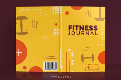


Here’s the trick most miss:
Match the visual language of the niche.
Gym = bold, aggressive
Self-care = soft, calm
Finance = clean, structured
If you mismatch the vibe, it dies.
The Simple Cover Formula (Use This Every Time)
When I train juniors, I force them to follow this:
| Element | Rule |
|---|---|
| Subject | One main object only |
| Title | Readable from 2 meters |
| Colors | Max 2–3 colors |
| Style | Match niche expectation |
| Detail | Less = more |
Break this, and your cover struggles. Every time.
The Mistake That Kills 90% of Drawn Covers
You’re zoomed in while drawing.
Customers are zoomed out.
Big mismatch.
Here’s what I do:
- Export your cover
- Shrink it to thumbnail size (like 150px height)
If you can’t read it or understand it instantly…
It’s already dead on KDP.
“I Can Draw Well But Still No Sales” — Here’s Why
Hard truth.
You’re designing for yourself.
Buyers don’t want:
- complex shading
- detailed backgrounds
- artistic compositions
They want:
- clarity
- speed
- familiarity
Familiar sells. Unique only works after you’re established.
Fast Ideas You Can Draw Today (No Overthinking)
Pick one and execute:
- A black cover + white bold title journal
- A cute cat holding a coffee mug notebook
- A repeating heart pattern diary
- A kids maze book with a big maze on front
- A gym log with a single dumbbell sketch
- A self-care journal with a calm pastel flower
Don’t brainstorm for days.
Ship.
Still Not Selling? Check These Before Blaming Your Cover
Sometimes it’s not even the drawing.
Quick checks:
- Title mismatch (cover says one thing, listing says another)
- Wrong category on Amazon KDP
- No niche targeting (too generic)
- Price too high for low-content
Fix those before redesigning everything.
The One Thing I Wish Everyone Knew From Day One
You’re not an artist here.
You’re a problem solver using visuals.
The moment you shift from:
“How do I make this look good?”
to:
“How do I make this instantly understood?”
…your sales change.
If you want, I can break down exact niches that are printing money right now and give you specific cover ideas for each.