
Hardcover printing is one of those things that looks simple from the outside. Then you try it once… files get rejected, covers don’t align, spine text is off, printer asks weird questions—and suddenly you’re stuck.
Yeah. Happens to everyone.
I’ve watched people waste weeks (and money) on mistakes that take 5 minutes to fix—if you know where to look.
So I’m going to walk you through this like I would with a junior sitting next to me.
No fluff. Just the stuff that actually matters.
The #1 Reason Hardcover Printing Goes Wrong (And How To Check It)
Most people think printing fails because of “bad design.”
Nope.
It’s almost always wrong specifications.
Printers don’t guess. They follow exact measurements:
- Trim size
- Bleed
- Spine width
- Cover wrap
Miss one? Everything shifts.
Quick check:
- Did you use your printer’s exact template?
- Or did you “estimate” the spine width?
If you estimated… that’s your problem.
What “Hardcover Printing” Actually Means (So You Stop Guessing)
Let’s clear the confusion.
A hardcover book isn’t just a thick cover. It’s a system:
- Case (the hard shell) – usually cardboard wrapped in cloth or printed paper
- Text block – your printed pages glued together
- Endpapers – the pages that attach the text block to the case
- Spine board – gives that rigid backbone
Think of it like this:
Paperback = pages + flexible cover
Hardcover = pages glued into a box
That “box” changes everything—especially your cover file.
The Cover File Mistake Everyone Makes
This is where most authors crash.
They design the front cover like a paperback… then panic when the printer asks for a full wrap file.
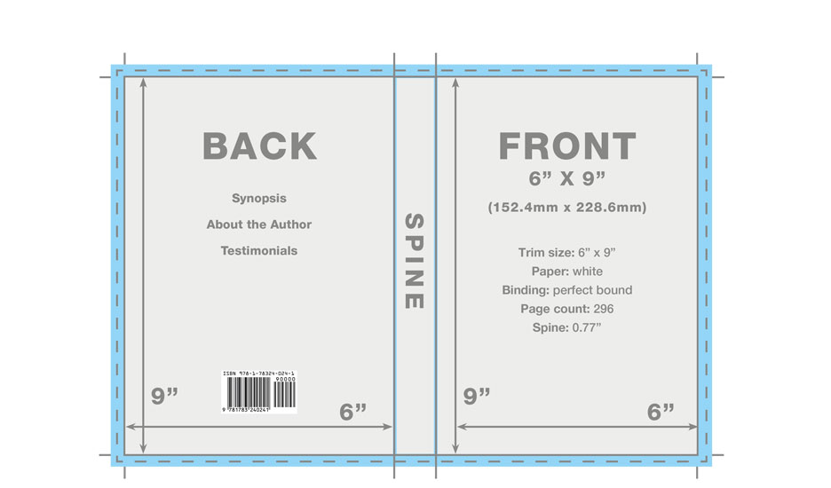
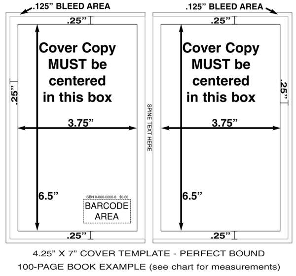
A hardcover cover is ONE flat file that includes:
- Back cover
- Spine
- Front cover
- Bleed on all sides
- Extra wrap (hinge area)

The one thing you cannot miss:
👉 Spine width must be exact.
Not close. Not “about right.”
Exact.
Because:
- Too thin → cover buckles
- Too thick → spine text shifts or folds
Spine Width: The Simple Formula Most People Ignore
You don’t guess spine width. You calculate it.
It depends on:
- Page count
- Paper thickness (called GSM or PPI)
Here’s the reality:
| Paper Type | Typical Spine Rule |
|---|---|
| Cream paper | ~0.0025 inches per page |
| White paper | ~0.0023 inches per page |
So:
300 pages × 0.0025 = 0.75 inch spine
But here’s the catch…
Every printer has slightly different paper.
So the real move?
👉 Use THEIR calculator or template. Always.
Case Laminate vs Dust Jacket (This Choice Matters More Than You Think)
This is where new authors get blindsided.
You have two main hardcover styles:
Case Laminate (Printed Directly on Cover)


- Design is printed on the hard cover itself
- No removable jacket
- Cheaper
- Durable
👉 Best for: self-publishing, Amazon KDP, budget runs
Dust Jacket (Removable Cover)


- Printed paper wraps around the book
- Includes flaps (inside folds)
- Looks premium
👉 Best for: bookstores, traditional publishing, high-end books
The mistake people make:
They design for one… and upload for the other.
Printers reject it instantly.
The Interior File Problem Nobody Explains Properly
You uploaded your manuscript. It looked fine on screen.
Then the proof comes back… and margins are weird.
Yeah. That’s binding.
Hardcovers need bigger inner margins (gutter) because the pages sit deeper inside the case.
Rule of thumb:
- Paperback gutter: ~0.5 inch
- Hardcover gutter: 0.75–1 inch
If you ignore this:
- Text disappears into the spine
- Book becomes hard to read
Paper Choice: This Quietly Changes Everything
Nobody talks about this enough.
Paper affects:
- Spine width
- Print quality
- Weight
- Cost
Common options:
- Cream paper → novels, easier on eyes
- White paper → textbooks, sharper contrast
- Coated paper → images, photography books
Here’s the hidden issue:
👉 Switching paper type after designing your cover = spine mismatch
And now your entire cover is wrong.
Printing Methods: Why Your Cost Jumps Suddenly
You’ll run into two options:
Print-on-Demand (POD)
- Used by Amazon KDP and IngramSpark
- Print one copy at a time
- No inventory
Pros:
- Low risk
- Easy setup
Cons:
- Higher cost per book
- Limited customization
Offset Printing
- Bulk printing (500–5000+ copies)
- Done by large print houses
Pros:
- Cheap per unit
- Premium quality
Cons:
- High upfront cost
- Storage needed
The trap:
People compare POD vs offset pricing without understanding volume.
At 50 copies → POD wins
At 2000 copies → offset destroys POD pricing
File Setup: The Stuff That Gets Your Book Rejected Instantly
Printers don’t explain this clearly. They just reject your file.
Here’s what actually matters:
Interior file:
- PDF format
- Embedded fonts
- No RGB images (use CMYK)
- Correct trim size
Cover file:
- Includes bleed (usually 0.125 inch)
- Correct spine width
- High resolution (300 DPI)
The silent killer:
👉 RGB colors
They look bright on screen… dull in print.
Always convert to CMYK before exporting.
Why Your Proof Copy Looks “Off” (Even When You Did Everything Right)
This one frustrates people the most.
You followed instructions. Still looks wrong.
Here’s why:
- Screen = light (RGB)
- Print = ink (CMYK)
They will never match exactly.
Also:
- Paper absorbs ink
- Dark colors get darker
- Fine details soften
What to do:
- Slightly brighten your images before print
- Avoid super dark backgrounds for text-heavy pages
The “My Hardcover Feels Cheap” Problem
You printed your book… and it doesn’t feel premium.
Common causes:
- Thin board (cheap printers cut corners)
- Glossy laminate instead of matte
- Weak binding glue
- Light paper weight
Fix:
Ask for:
- 2.5–3 mm board thickness
- Matte or cloth finish
- Higher GSM paper
Quick Reality Check Before You Print (Don’t Skip This)
Run through this mentally:
- Did I use the printer’s template?
- Is my spine width calculated from THEIR specs?
- Did I adjust gutter margins for hardcover?
- Is my file CMYK, not RGB?
- Am I designing for the correct cover type (case vs jacket)?
Miss even one? You’re gambling.
The One Thing I Wish Every New Author Knew
People obsess over design.
Fonts. Colors. Fancy covers.
But hardcover printing is engineering first, design second.
Get the structure wrong… nothing else matters.
Get the structure right?
Everything suddenly works.
You’re not stuck because this is hard.
You’re stuck because nobody showed you the real moving parts.
Now you’ve seen them.
Fix the specs → fix the book.