
Let me say something first, because almost everyone arrives here annoyed.
You’ve probably written the book. Maybe even edited it. Maybe three times. Then someone says, “Now we need to do layout and design.”
And suddenly the manuscript that looked fine in Word turns into a mess.
Lines break in weird places.
Chapter headings jump around.
Spacing looks amateur.
Page numbers wander off like they have somewhere better to be.
Yeah. Happens to everyone the first time.
Here’s the thing most people don’t realize:
Editing and layout are two completely different jobs.
One fixes the language.
The other builds the architecture of the book.
If those two processes collide at the wrong time, the whole book becomes unstable. I’ve seen manuscripts go through five rounds of editing because nobody understood that separation.
Let’s untangle it properly.
The Editing Stage Most Authors Misunderstand

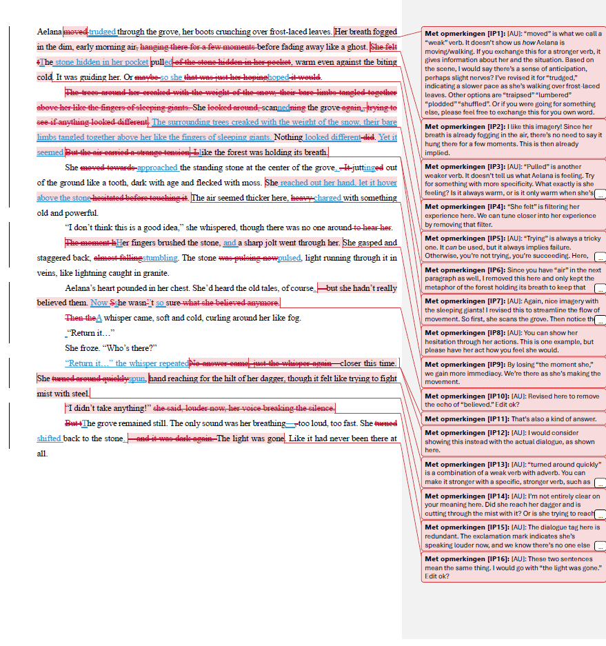
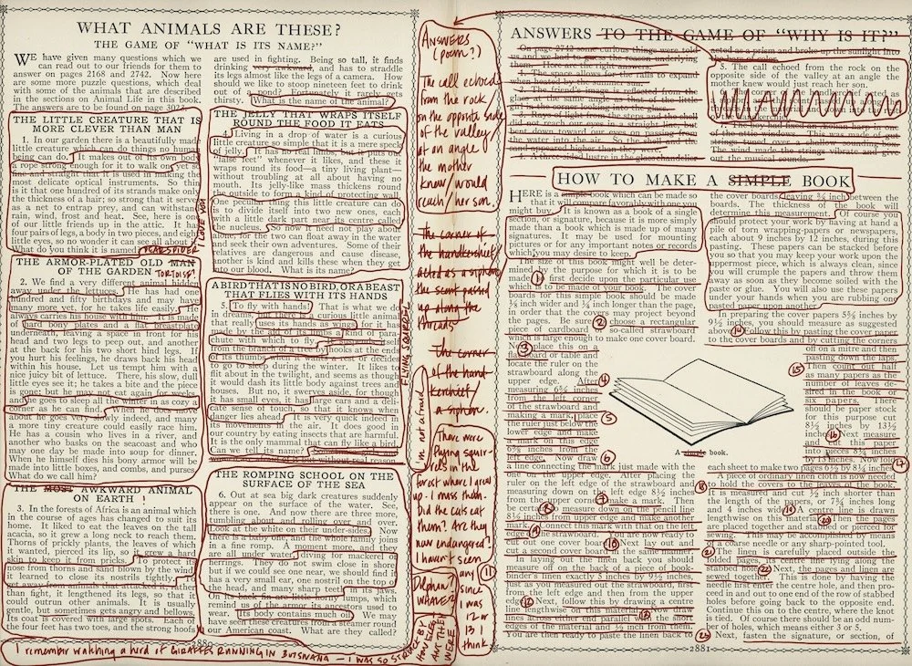
Editing in publishing usually happens in three layers. People mix these up constantly.
Developmental Editing
This is the big structural work.
Think of it like renovating a house before painting it.
A developmental editor looks at:
- Story structure or argument flow
- Chapter order
- Missing information
- Redundant sections
- Reader clarity
At this stage, pages are still fluid. Whole chapters might move.
Trying to design layout now is pointless.
Line Editing
Now the sentences get attention.
This is where editors adjust:
- Tone
- Flow
- Voice consistency
- Clarity
Paragraphs shift. Sentences shrink or expand. Dialogue may move.
Still too early for layout.
Copyediting
Now we get into technical territory.
Copyediting handles:
- Grammar
- Punctuation
- Style guide rules (Chicago Manual is the usual suspect)
- Consistent spelling
- Citation formatting
Once copyediting is done, the manuscript is stable enough for typesetting.
That’s the moment layout begins.
Miss this order and you’re redesigning pages over and over.
What “Layout and Design” Actually Means


People hear design and think covers.
Different universe.
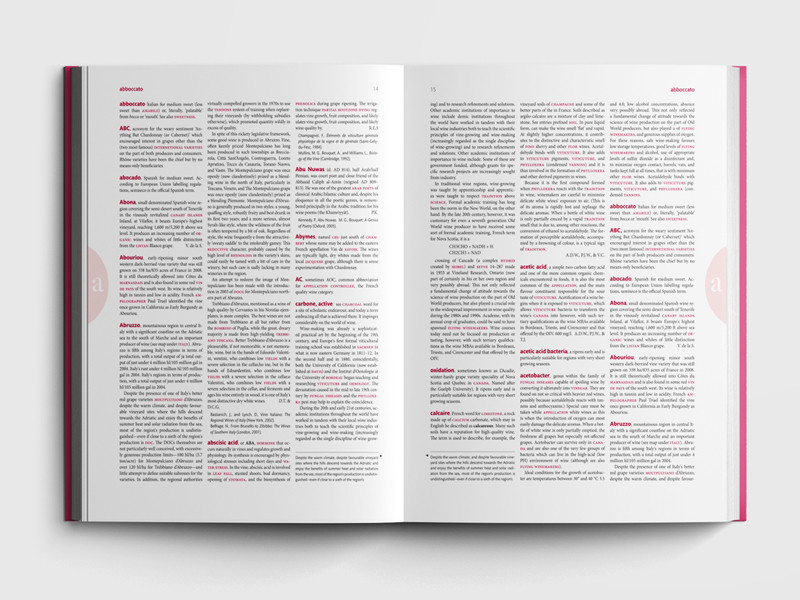
Interior layout is about readability over hundreds of pages.
A professional layout designer handles things like:
- Page margins
- Gutters (the inner margin near the spine)
- Line spacing
- Font pairing
- Chapter opening pages
- Running headers
- Page numbering
- Widows and orphans
That last one always gets a laugh.
But it matters.
A widow is a single line of a paragraph stranded at the top of a page.
An orphan sits alone at the bottom.
Both look sloppy in a printed book. Fixing them is part of professional typesetting.
Word processors are terrible at this. That’s why we use tools like:
- Adobe InDesign
- Affinity Publisher
- LaTeX (common in academic publishing)
Each handles long-form layout properly.
The Simple Fix Most Beginners Miss
Here’s the mistake I see constantly.
Authors bring me manuscripts filled with manual formatting.
Things like:
- 14 different fonts
- random tabs for indents
- spaces used to center titles
- manual page breaks everywhere
- inconsistent heading styles
Layout software hates that.
Before typesetting, the manuscript should be clean and boring.
What that looks like:
| Element | Correct Setup |
|---|---|
| Paragraphs | One style, no manual indents |
| Chapter titles | One consistent heading style |
| Scene breaks | Use *** or blank line |
| Alignment | Left aligned only |
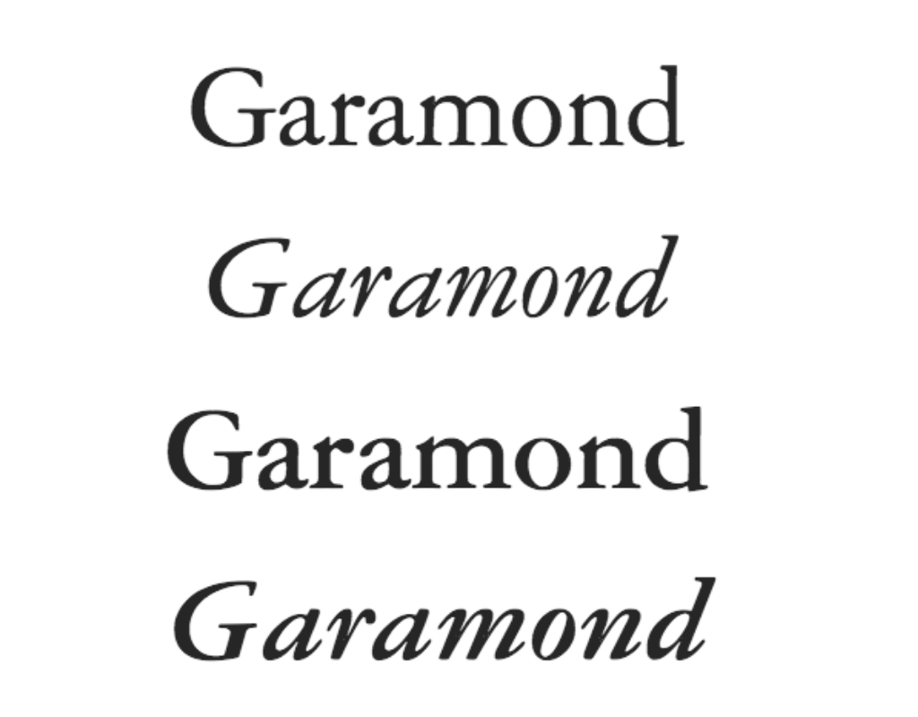
| Fonts | One standard font (Times or Garamond) |
No fancy formatting.
Just structure.
Why?
Because layout software applies style sheets to everything at once.
If the manuscript is messy, styles break.
Then someone has to fix hundreds of pages manually.
Not fun.
Page Design: The Stuff Readers Feel But Never Notice


4
Good layout disappears.
Bad layout screams.
Readers notice problems like:
- text packed too tight
- huge margins
- awkward line breaks
- weird fonts
- giant chapter titles
- inconsistent spacing
Professional designers think about typographic color.
Strange term. Simple idea.
When you glance at a page, the text block should look even and calm, like a soft gray rectangle.
If parts look darker or lighter, spacing is wrong.
Fixing that involves adjusting:
- leading (line spacing)
- tracking (letter spacing)
- hyphenation rules
- justification settings
Tiny changes. Massive impact on readability.
The Formatting Rules That Change Between Print and Ebook
People assume a book layout works everywhere.
It doesn’t.
Print and ebooks behave differently.
| Feature | Print Book | Ebook |
|---|---|---|
| Page numbers | Fixed | Dynamic |
| Font choice | Designer controls | Reader chooses |
| Margins | Fixed | Adjustable |
| Page breaks | Permanent | Fluid |
| Layout control | Precise | Limited |
In ebooks (Kindle, EPUB), the reader controls:
- font size
- line spacing
- margins
- sometimes even font style
That means complex layouts often break.
Designers simplify heavily for digital editions.
The Weird Edge Case That Breaks Layout
After decades doing this, one issue shows up again and again.
Tables.
Especially tables copied from Microsoft Word.
They behave fine until typesetting starts. Then they explode across pages or destroy margins.
When that happens, the fix is usually:
- recreate the table in the layout software
- convert it to an image
- or redesign it entirely
Academic books deal with this constantly.
Another nasty one: footnotes vs endnotes. Switching those late in production can wreck hundreds of pages.
Proof Pages: The Stage Everyone Underestimates


4
Once layout is done, the publisher produces proofs.
These look like finished book pages.
Now the final check begins.
Things editors look for:
- bad line breaks
- missing italics
- spacing problems
- incorrect page headers
- widows and orphans
- incorrect figure placement
But here’s the rule that surprises people:
Proofs are not for rewriting.
Change too much and the layout collapses again.
Small corrections only.
When Authors Try To Do Everything Themselves
Self-publishing changed the landscape.
Tools like:
- Vellum
- Atticus
- Kindle Create
make basic layout possible without a designer.
For straightforward novels? Perfectly fine.
For complex books — textbooks, cookbooks, illustrated nonfiction — professional typesetting still wins.
Those books involve:
- image anchoring
- captions
- callouts
- multi-column layouts
- tables
- sidebars
Automation struggles there.
The One Thing I Wish Every Author Knew From Day One
Layout isn’t decoration.
It’s engineering for reading.
Every margin, font size, line break, and header exists for a reason:
- eye fatigue
- page balance
- readability over hours
- print binding constraints
When done right, readers never think about it.
They just keep turning pages.
That’s the whole goal.
And once you understand that difference — editing builds the text, layout builds the reading experience — book publishing suddenly makes a lot more sense.