
Yeah… this one frustrates people fast.
You design a few pages, everything looks clean on screen… then you print it and suddenly:
- Ink bleeds through
- Pages stick together
- Kids can’t color properly
- Or worse — it looks like a cheap photocopy
That’s where most people quit.
Let’s fix it properly.
The Real Problem (Why Most Custom Coloring Books Turn Out Bad)
It’s not your design.
It’s paper + layout + printing method mismatch.
Coloring books are not normal books.
They have different rules:
- Pages need to handle markers, not just reading
- Images must be clean line art, not shaded
- Paper must resist bleed-through
- Binding must allow pages to lie flat
Miss any one of these… the whole book feels wrong.
First Decision: What Are You Actually Making?
Before touching software, lock this down.
What kind of coloring book is it?
- Kids (ages 3–6) → big shapes, thick lines
- Kids (7–12) → medium detail
- Adults → fine detail, complex patterns
The level of detail controls everything.
Too detailed for kids? They get frustrated.
Too simple for adults? They get bored.
The #1 Rule Nobody Tells You About Coloring Books
Every page must be single-sided.
Not optional.
Why?
Markers bleed. Even “good” paper can’t fully stop it.
So you design like this:
- Page 1 → artwork
- Page 2 → blank
- Page 3 → artwork
- Page 4 → blank
Yes, it doubles your page count.
But it saves the entire experience.
What Your Pages Should Actually Look Like (Not What You Think)
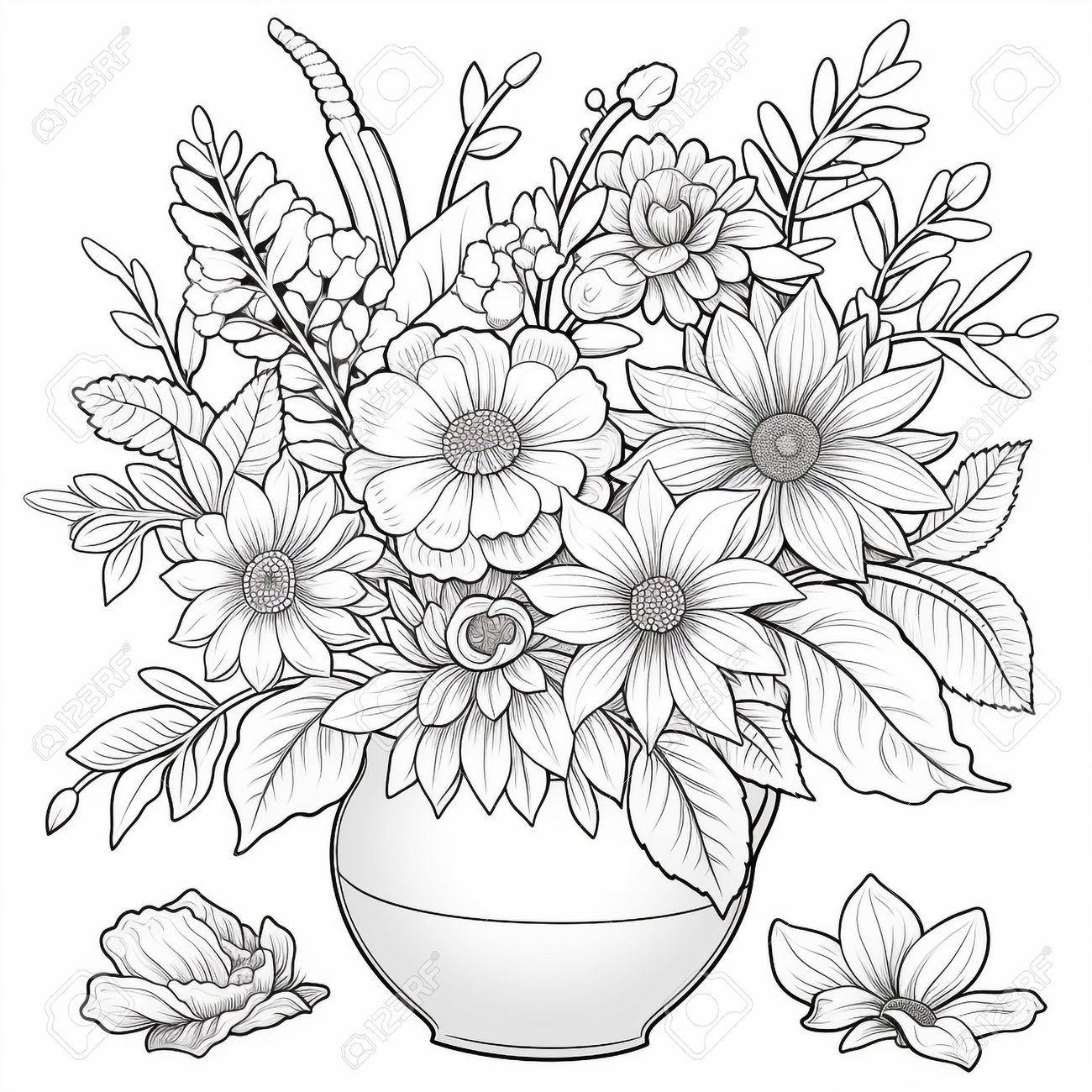


Look closely at those.
Notice:
- Pure black lines
- No grey shading
- No gradients
- Clean white background
That’s not a style choice.
That’s a printing requirement.
Fix Your Artwork (This Is Where Most People Fail)
If you’re using:
- Adobe Illustrator
- Photoshop
- Canva
Make sure of this:
Non-negotiables
- Black lines only (#000000)
- Resolution: 300 DPI minimum
- No shadows, no gradients
- Line thickness:
- Kids: 2–4 pt
- Adults: 0.5–1.5 pt
Quick test (don’t skip this)
Zoom to 300%.
If lines look fuzzy or pixelated → it will print ugly.
The Paper Mistake That Ruins Everything
This is the one I see constantly.
People print on normal book paper (70–80 gsm).
Then markers bleed through instantly.
What you actually need:
- Minimum: 100–120 gsm
- Ideal: 120–160 gsm
Think of paper like tissue vs cardboard.
Regular books = tissue.
Coloring books = closer to light card.
Binding: Why Your Book Won’t Stay Open
You try to color… the page keeps closing.
Annoying.
That’s a binding issue.
Here’s the reality:
| Binding Type | Good for Coloring? | Why |
|---|---|---|
| Perfect bound (glued spine) | ❌ Not great | Doesn’t lay flat |
| Spiral / coil | ✅ Best | Opens completely |
| Saddle stitch (staples) | ✅ Good (thin books) | Cheap and flat |
Best choice? Spiral binding. Always.
Especially for kids.
The Easy Way: Print Online Without Overthinking
Use:
- Amazon KDP
- Lulu
- Blurb
But here’s the catch most people miss:
These platforms are built for books, not coloring books.
So:
- Paper options are limited
- Binding is usually glued (not ideal)
Use them only if:
- You want cheap copies
- You’re okay with basic quality
The Better Way (Most People Should Do This Instead)
Go to a local print shop.
Walk in with your PDF and say:
“Single-sided coloring book, 120 gsm paper, spiral binding.”
That one sentence saves you 2 hours of explaining.
They’ll know exactly what to do.
Fix It In 20 Minutes: Make Your File Print-Ready
Using Microsoft Word or Adobe InDesign:
Setup that just works
- Size: 8.5″ x 11″ OR 8″ x 10″
- Margins: 0.5″ all sides
- Insert blank pages between designs
- Export as PDF
Important detail
Turn OFF “double-sided printing” in your mind.
You are designing for one side only.
The Weird Issue That Confuses Everyone
“Why does my black look grey when printed?”
Because printers don’t print pure digital black the same way.
Fix:
- Use 100% K black (not RGB black)
- In PDF export, choose print quality
If you ignore this, your lines look washed out.
Cost Reality (So You Don’t Get Surprised)
- Local print shop:
- $5 – $15 per copy (depending on pages & paper)
- Online (KDP etc):
- $3 – $8 (lower quality paper)
Coloring books are cheap to print… until you upgrade paper.
That’s where cost jumps.
Still Getting Bad Results? Check These Fast
Run through this quickly:
- Lines look blurry → low resolution
- Ink bleeding → paper too thin
- Book won’t stay open → wrong binding
- Images look dull → wrong color mode
- Kids struggling → lines too thin or too complex
One of these is always the culprit.
The “I Wish Someone Told Me This Earlier” Part
Don’t try to make it perfect digitally.
Print a rough copy early.
Even if it’s ugly.
Hold it. Color one page.
That moment tells you more than 2 hours of screen tweaking.
The Clean Workflow That Actually Works
Here’s the flow I use every time:
- Create 10–20 pages first (not 100)
- Print a test copy (cheap paper is fine for testing)
- Adjust:
- Line thickness
- Spacing
- Page flow
- Then finish the full book
- Final print on good paper
Most people skip the test phase.
That’s why they waste money.
You don’t need fancy tools.
You don’t need perfect art.
You need:
- Clean black line art
- Thick enough paper
- Correct binding
Get those three right, and your coloring book immediately feels “real.”
That’s the difference.