
4
Let me start with something that surprises most new writers.
Editors and agents don’t want fancy formatting. Not beautiful fonts. Not creative layouts. Not “designed” pages.
They want the exact opposite.
Plain. Boring. Consistent.
Why? Because they read thousands of manuscripts a year. If every writer formatted their document differently, editing would be a nightmare.
So the industry settled on something simple called standard manuscript format. Think of it as the “uniform” your manuscript wears when it walks into a publisher’s office.
Miss the format and you immediately look inexperienced. Follow it and you disappear into the background — which is exactly what editors want.
Let’s break down what this actually means.
The Core Rule: Make It Easy To Read And Edit
The whole purpose of standard manuscript format is legibility.
Editors print manuscripts. They scribble notes in margins. They track changes. They skim pages fast.
Everything in the format supports that workflow.
If a formatting choice makes editing harder, it doesn’t belong.
Which is why the format has barely changed in decades.
The Basic Standard Manuscript Format (The Version Most Publishers Expect)
Here’s the format used across fiction, short stories, and most book manuscripts.
| Element | Standard Setting |
|---|---|
| Font | Times New Roman |
| Font size | 12-point |
| Line spacing | Double-spaced |
| Margins | 1 inch on all sides |
| Paragraph indentation | 0.5 inch (tab) |
| Alignment | Left aligned (not justified) |
| Page numbers | Top right corner |
| Header | Last name / book title / page number |
Nothing fancy.
Just clean, readable text.
The Title Page (Most Beginners Forget This)
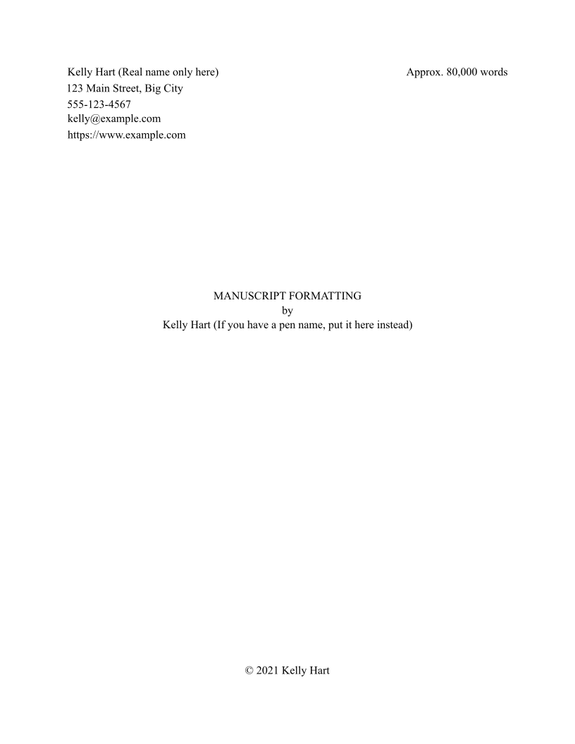

The first page of your manuscript isn’t your story.
It’s the title page.
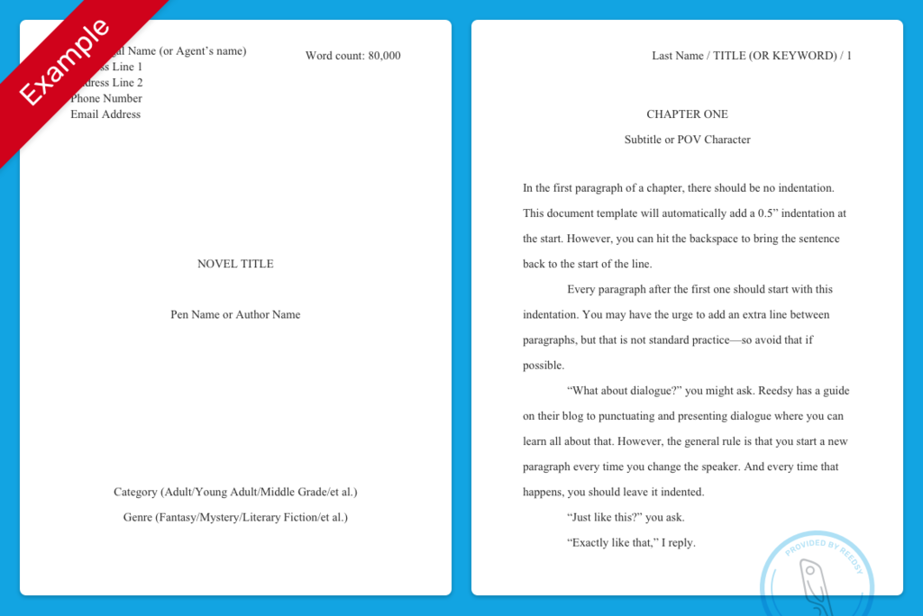
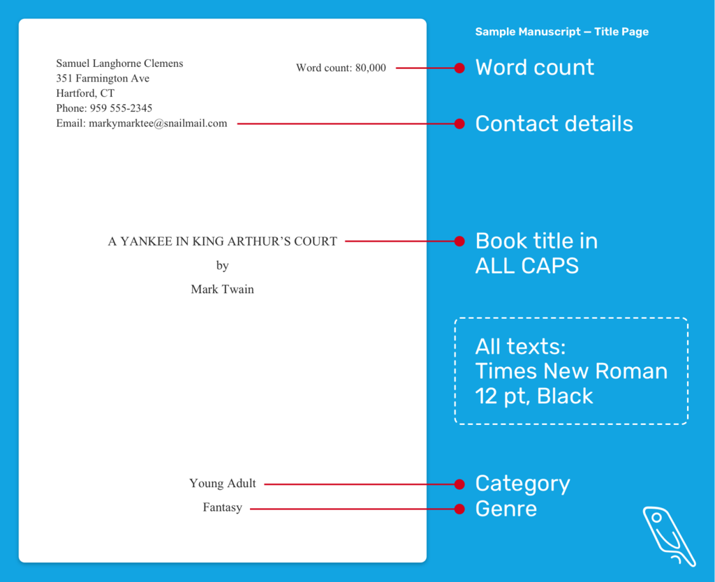
Editors want quick information before they start reading. Here’s what usually goes there:
Top left corner:
- Your name
- Address
- Phone number
Centered halfway down the page:
- Manuscript title
- Author name (or pen name)
Top right corner:
- Approximate word count
(Example: 82,000 words)
Then the manuscript itself starts on the next page.
Simple. Clean.
The Header Every Page Needs
Once the manuscript starts, each page gets a header.
Most writers miss this, and editors notice immediately.
The header usually looks like this:
Smith / Silent Forest / 23
That means:
- Author last name
- Short title of the manuscript
- Page number
Place it in the top right corner.
If a page gets dropped or shuffled during editing (which still happens), the editor can instantly identify where it belongs.
Paragraph Formatting (The Thing Everyone Overthinks)
This part is easy.
Just do this:
- Indent each new paragraph with the TAB key
- Do not add extra spacing between paragraphs
- Keep everything double-spaced
That’s it.
And one small trick experienced writers use:
Never hit space multiple times to indent.
Always use the tab key or a paragraph indent setting.
Spaces break formatting later.
Scene Breaks (When the Story Jumps)
Sometimes the story changes location or time.
When that happens, editors expect a scene break marker.
The common version looks like this:
#
Centered on its own line.
Some writers use:
***
Either works. But keep it consistent throughout the manuscript.
Dialogue Formatting (Another Spot Beginners Slip)
Dialogue is just normal paragraph formatting.
Example:
“I didn’t expect to see you here,” Sarah said.
New speaker?
New paragraph.
Always.
Readers rely on that visual cue. Without it, dialogue becomes a mess.
The #1 Mistake New Writers Make
Fancy formatting.
I’ve seen manuscripts submitted in:
- Script fonts
- Colored text
- Justified margins
- Single spacing
- Paragraph spacing instead of indentation
- Decorative chapter headings
Looks nice. Completely wrong.
Remember the rule:
The manuscript isn’t the book design.
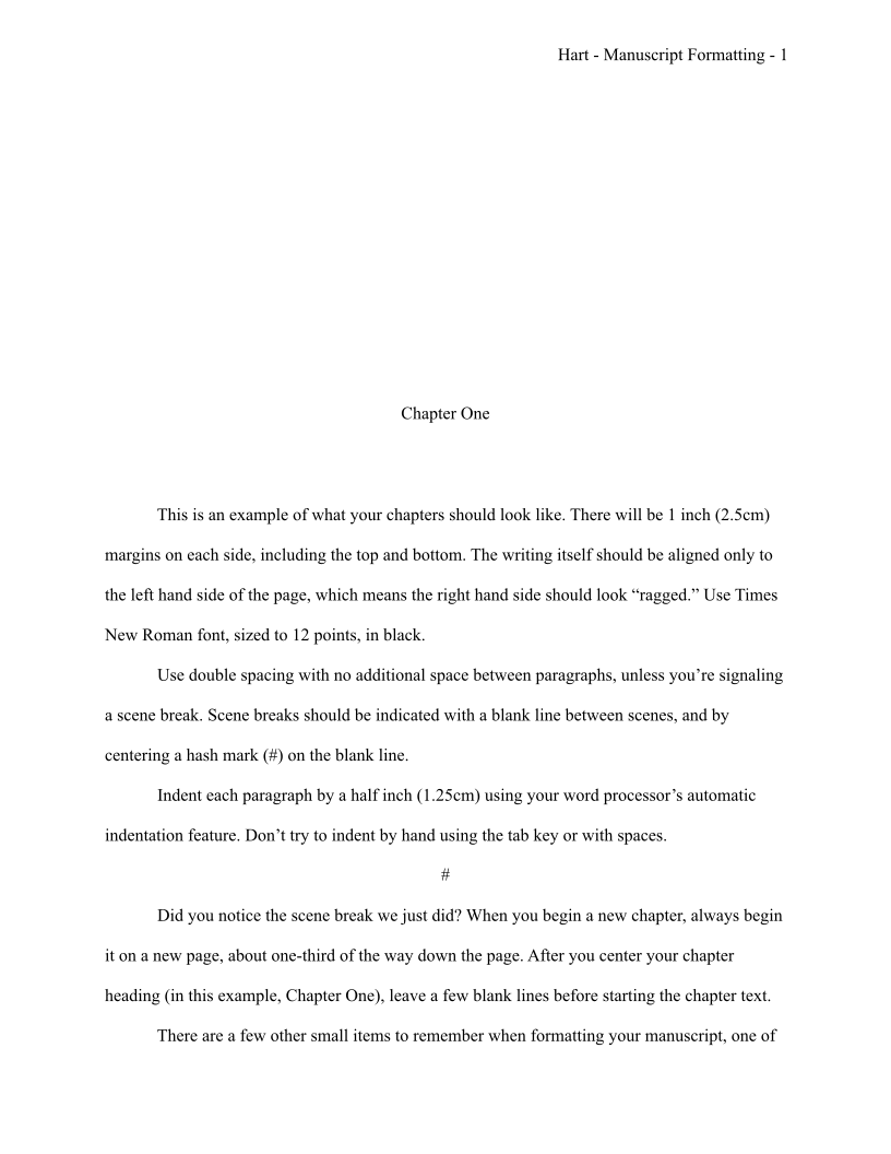
Design happens after acceptance. Your job is to deliver clean text editors can work with.
Chapter Formatting (Simple And Clean)
Each new chapter should start on a new page.
Most manuscripts format chapters like this:
Chapter 5
Centered about one-third down the page.
Then start the text a few lines below.
No decorative graphics. No large fonts.
Just clarity.
Quick Manuscript Formatting Checklist
Before sending your manuscript anywhere, check these:
- 12-point Times New Roman
- Double spaced
- 1-inch margins
- Left aligned
- Tab indentation
- Header with name/title/page number
- Title page included
If those are correct, you’re already ahead of half the submissions editors receive.
One Thing I Wish Every Writer Knew Early
Formatting doesn’t make your writing better.
But bad formatting absolutely makes your work look amateur.
Editors form impressions in seconds.
Clean manuscript formatting sends a signal:
This writer understands publishing standards.
And that buys you something valuable.
More patience from the reader.
Which means your story actually gets a fair shot.
That’s the whole point.