
I’ve seen perfectly good novels get rejected, look amateur, or just feel “off” because of font choice alone. Not the story. Not the formatting. Just the font.
So if you’ve been staring at your manuscript thinking “why does this look wrong?” — you’re not crazy. It’s almost always the font.
Let’s fix it properly.
The Mistake Most People Make (And Why Their Book Feels “Off”)
People pick fonts based on what looks nice on screen.
That’s the trap.
Books are not screens. They’re long-form reading environments. Your reader is going to sit with 200–400 pages. What looks “cool” for a paragraph becomes exhausting by page 30.
The rule you need burned into your brain:
👉 A good novel font disappears.
If your reader notices the font, you picked the wrong one.
The 3 Fonts That Almost Never Fail (Print Novels)
These are the ones I’ve used across dozens of books. Safe. Professional. Readable for hours.
1. Garamond — The “Invisible” Classic

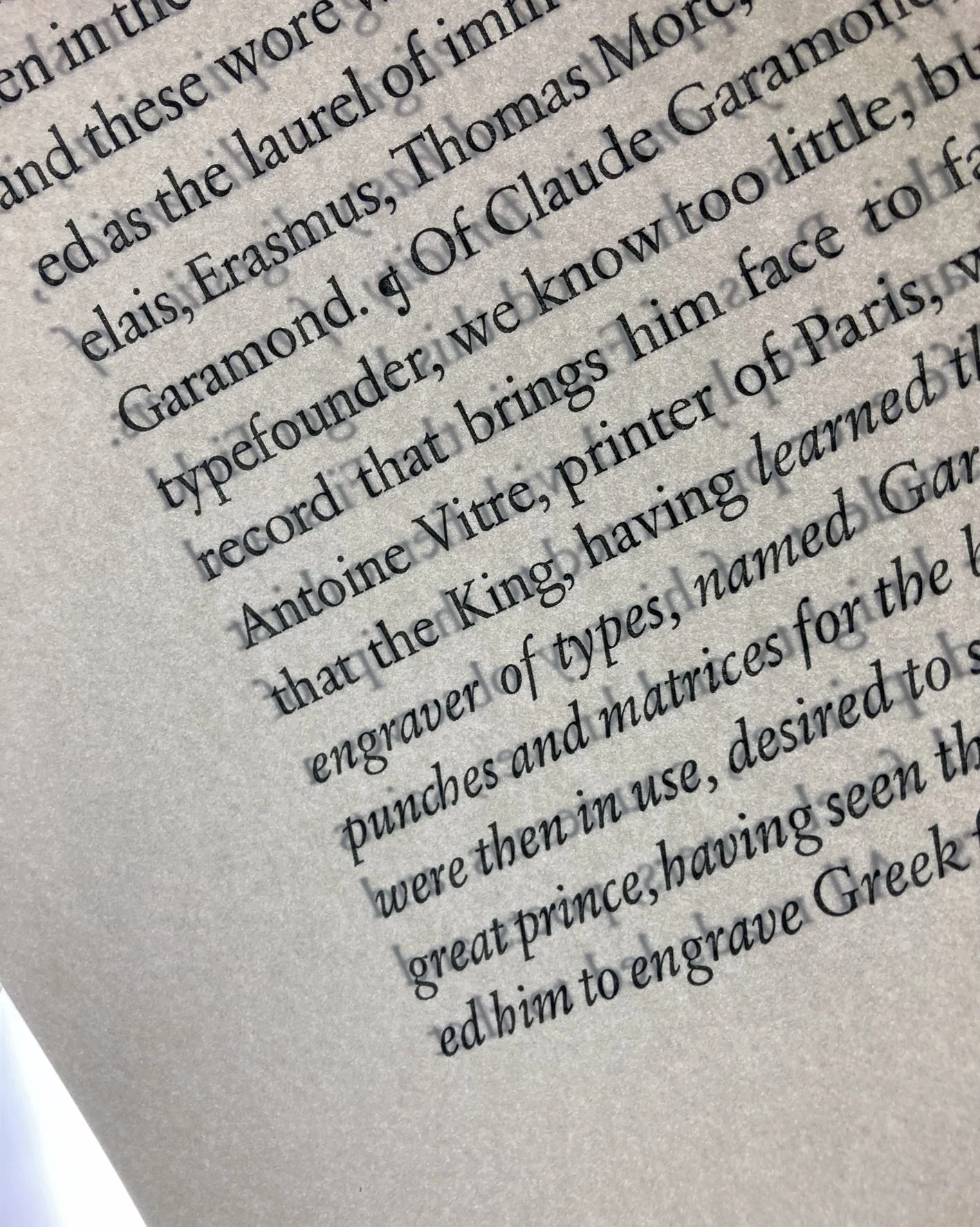
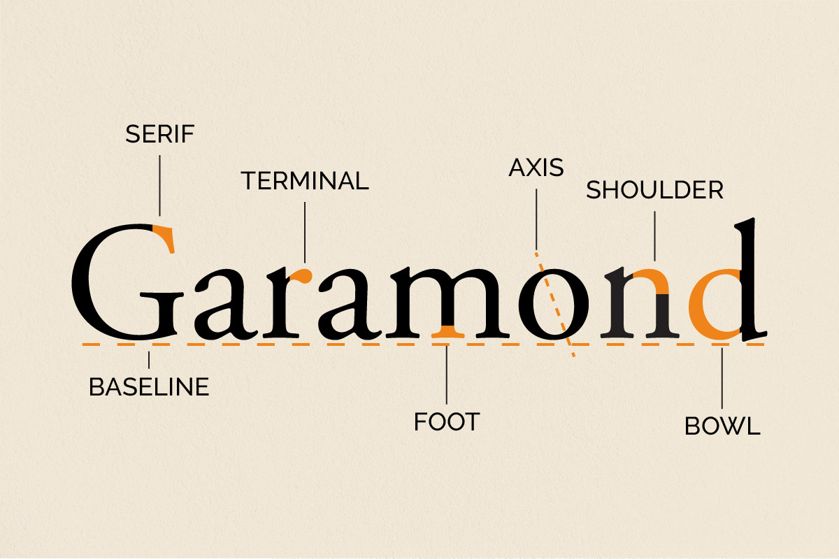
This is the one I reach for when I don’t want to think.
- Soft, slightly old-style serif
- Feels literary without trying
- Saves space (more words per page = lower print cost)
Best for:
- Fiction
- Literary novels
- Anything story-heavy
The one thing you don’t skip:
👉 Use 11–12 pt with proper line spacing (1.2–1.4).
Too small and it looks cheap. Too big and it looks like a children’s book.
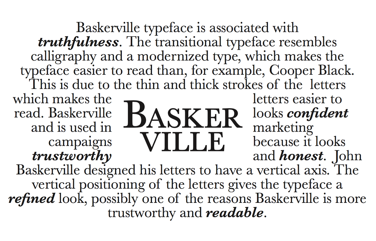
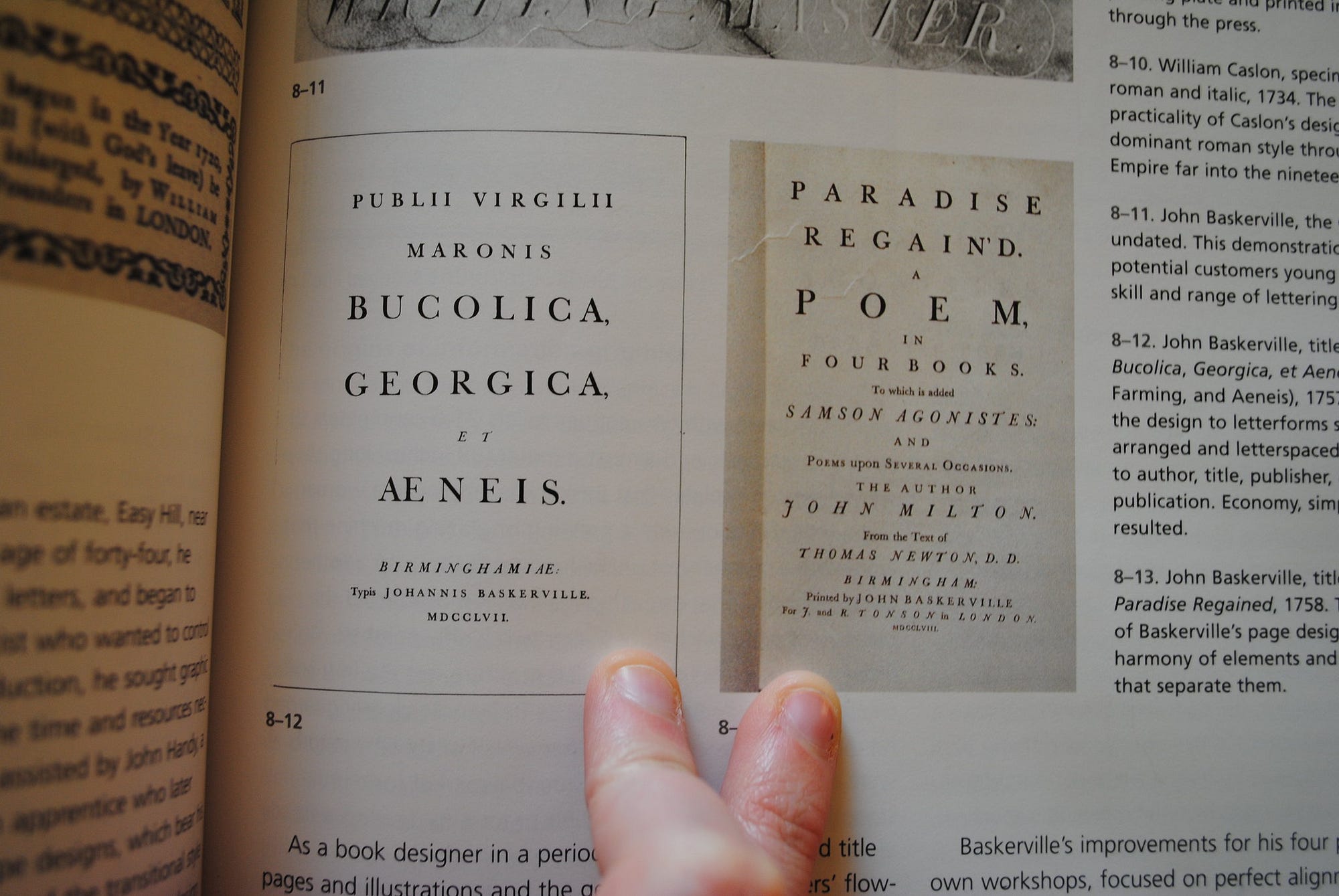
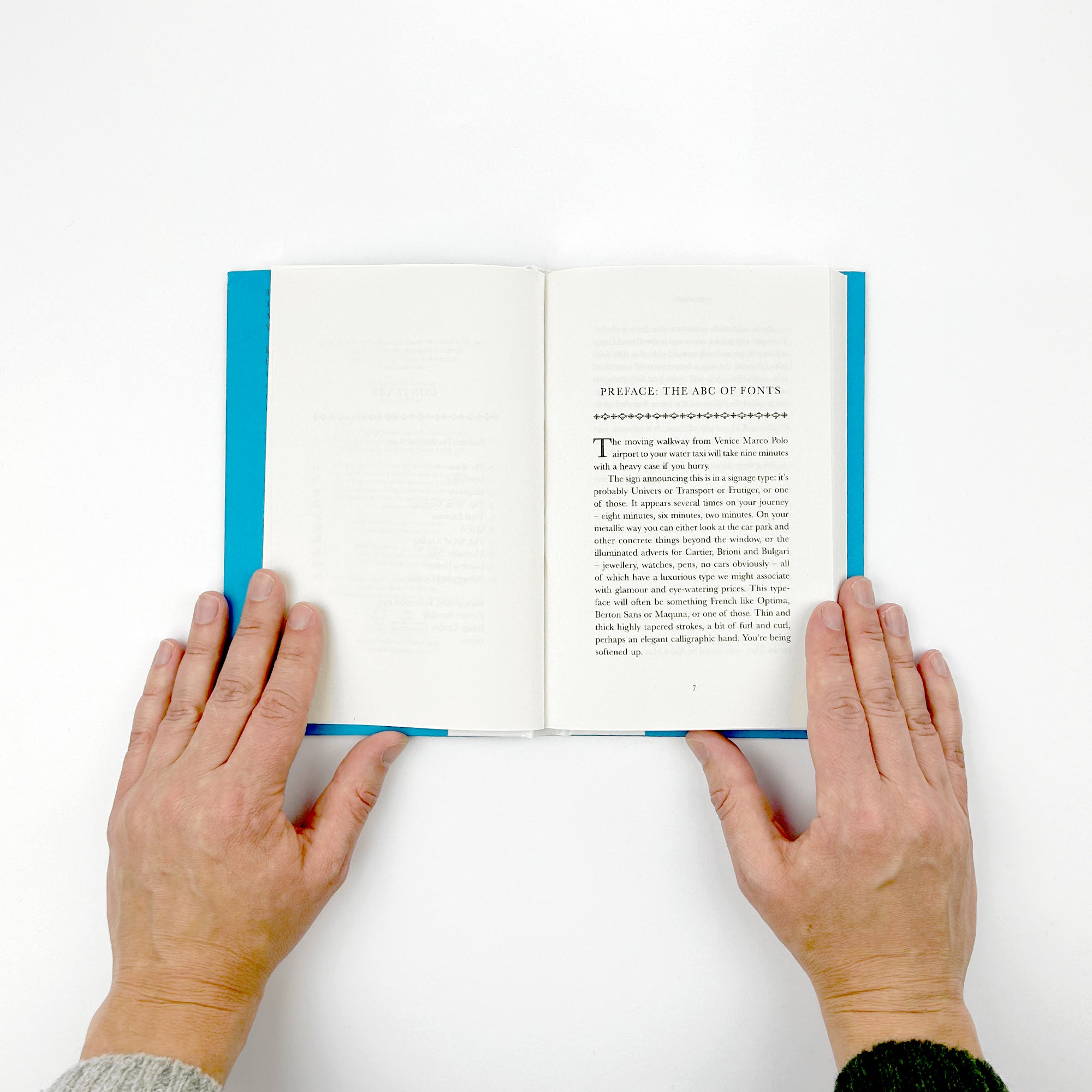
2. Baskerville — Cleaner, Sharper, More Premium
4
If Garamond is soft, this is crisp and confident.
- Higher contrast strokes
- Slightly more modern feel
- Looks amazing in print
Best for:
- Historical fiction
- Non-fiction that still reads like a narrative
- Premium-feel books
Watch this carefully:
👉 Don’t go too small — Baskerville gets harsh when cramped.
3. Times New Roman — Boring… But Bulletproof
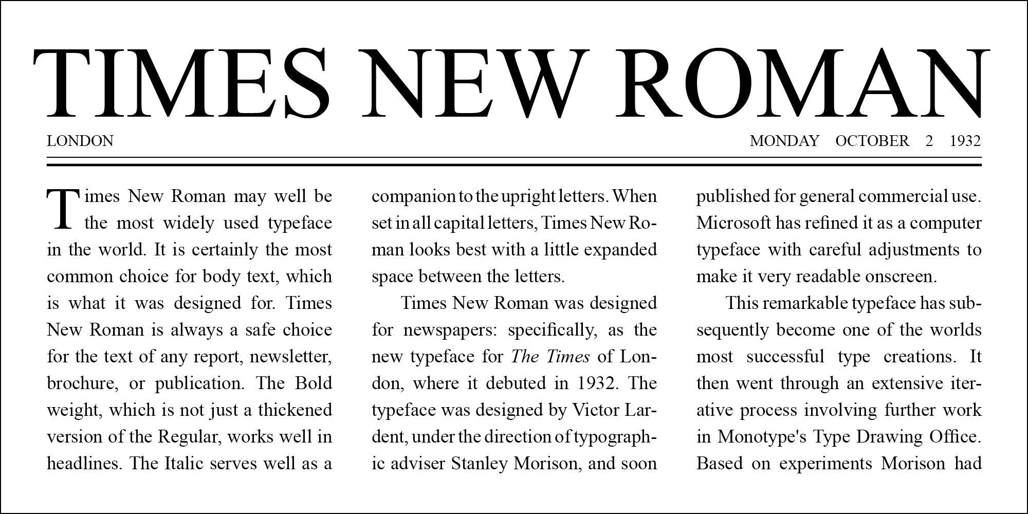

Everyone hates it. Everyone uses it. And there’s a reason.
- Extremely readable
- Works everywhere (especially on Microsoft Word and Google Docs)
- Zero compatibility issues
Best for:
- First-time authors
- KDP uploads (no surprises)
- Draft → publish pipelines
Hard truth:
👉 If you’re unsure, just use this and move on.
You won’t lose readers because of it.
Fonts That Work Better for Ebooks (Kindle Reality)
Here’s something most beginners don’t realize:
👉 Your font often gets overridden on Kindle.
Platforms like Amazon Kindle let readers choose their own font.
So your job is different here.
What actually matters:
- Clean formatting
- No weird spacing
- Simple font choice
Still, these are safe starting points:
- Georgia (very Kindle-friendly)
- Bookerly (Amazon’s default)
- Arial (for headings only)
Fonts You Should NOT Use (Even If They Look Cool)

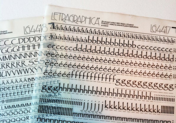
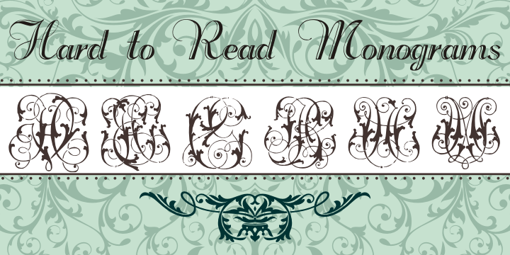
I’ve had to fix books where the font alone killed readability.
Avoid these like your print budget depends on it (because it does):
- Comic Sans
- Papyrus
- Any script/handwriting font
- Decorative serif fonts with heavy styling
Why they fail:
- Eye fatigue after a few pages
- Inconsistent spacing
- Look amateur instantly
👉 If it has “personality,” it probably doesn’t belong in body text.
The Real Problem Isn’t Font (It’s What You Pair With It)
This is the part almost nobody talks about.
A good font can still look terrible if you mess this up:
Spacing + Layout Combo
- Line spacing: 1.2–1.4 (not double spaced)
- Margins: Proper book trim size (KDP standard)
- Justification: Fully justified (with hyphenation ON)
Mess this up and even Garamond looks ugly.
Quick Comparison (So You Can Decide Fast)
| Font | Feel | Risk Level | My Use Case |
|---|---|---|---|
| Garamond | Classic, soft | Very safe | Most novels |
| Baskerville | Sharp, premium | Safe | Higher-end books |
| Times New Roman | Neutral | Zero risk | Beginners / KDP |
| Georgia | Screen-friendly | Safe | Ebook-first |
The One Thing I Wish Everyone Knew
People obsess over fonts like it’s branding.
It’s not.
👉 Your job is to make reading effortless, not impressive.
The best compliment your typography can get?
“Didn’t even notice it.”
That means the reader stayed in the story.
Still Not Sure? Do This 2-Minute Test
Open your manuscript in Microsoft Word or Google Docs.
Then:
- Set it in Garamond (12 pt)
- Read 3 pages straight
- Switch to Baskerville
- Read again
You’ll feel the difference instantly.
No theory needed.
Final Reality Check
You don’t win readers with fonts.
You lose them with bad ones.
Pick something safe. Set it correctly. Move on to the writing.
That’s how real books get finished.