
You’re asking “what’s the most common font used in books?” — and I’m guessing you’ve already tried something that looked fine on your screen… but felt wrong when you imagined it as a real book.
Yeah. That’s where most people get stuck.
The Short Answer (So You Don’t Overthink This)
The most common font used in books is serif fonts — especially Times New Roman, Garamond, and Baskerville.
But here’s the part nobody tells you:
👉 Most professionally printed books do NOT use Times New Roman.
That’s the beginner trap.
What Book Fonts Actually Look Like (Real Examples)
Classic Serif Fonts Used in Books


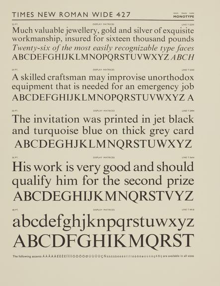
Notice something?
- Soft edges
- Slightly uneven stroke widths
- Easy flow from letter to letter
That’s not an accident. That’s readability engineering.
The #1 Reason People Pick the Wrong Font
You’re choosing based on what looks good on a screen, not what feels good after 200 pages.
Huge mistake.
Here’s what actually matters:
- Eye fatigue over long reading sessions
- Ink spread on paper
- Letter spacing at small sizes
- How paragraphs “flow” visually
Books are not designed to look pretty. They’re designed to disappear.
If your reader notices the font… you already lost.
The Real Industry Picks (What Pros Actually Use)
Here’s what you’ll find inside real novels and printed books:
| Font | Where It Shows Up | Why It’s Used |
|---|---|---|
| Garamond | Fiction, novels | Elegant, very readable, saves space |
| Baskerville | Literary books | Sharp, high contrast, premium feel |
| Caslon | Traditional publishing | Warm, classic, forgiving on paper |
| Sabon | Professional typesetting | Balanced and consistent |
| Minion Pro | Modern publishing | Clean, versatile, very safe choice |
Now here’s the blunt truth:
👉 If you’re self-publishing, Garamond or Baskerville will almost never get you in trouble.
Why Serif Fonts Win (And Sans-Serif Usually Fails)
Visual Difference That Actually Matters
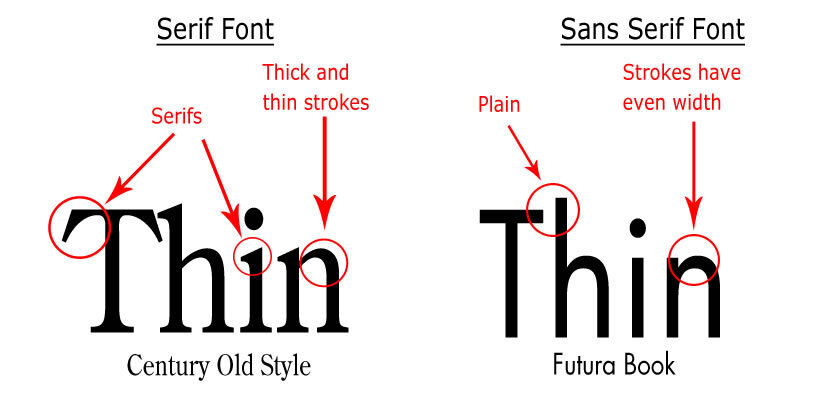
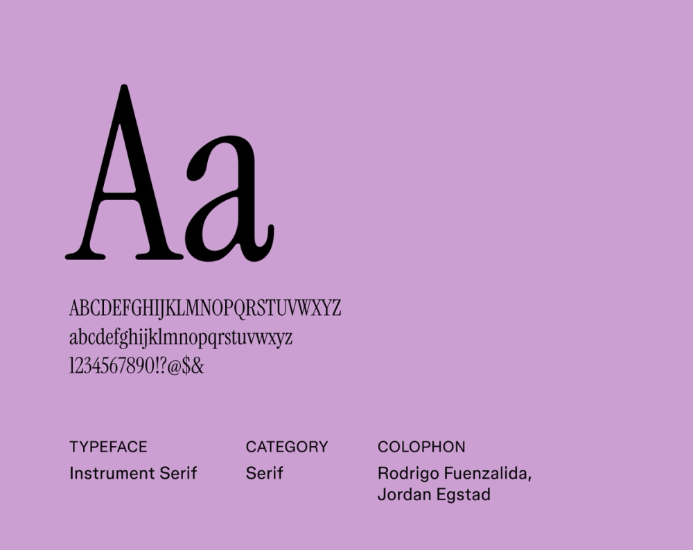
Serif fonts (those little “feet” on letters) do something subtle:
- They guide your eye horizontally
- They make word shapes more recognizable
- They reduce strain over long reading
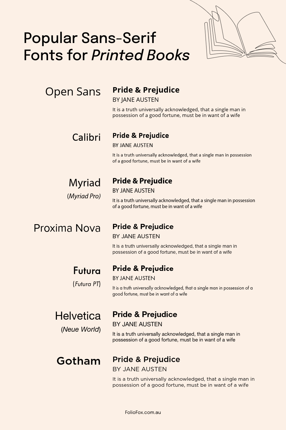
Sans-serif fonts (like Arial or Helvetica):
- Great for screens
- Terrible for long-form print reading
Not unusable… just not ideal.
The Simple Rule Most People Miss
Here it is. The one thing I wish people understood early:
👉 You’re not choosing a font. You’re choosing a reading experience.
That changes everything.
Quick Fix: If You Just Want a Safe Choice
Don’t overcomplicate it.
- Fiction / novels → Garamond
- Premium feel → Baskerville
- Modern clean look → Minion Pro
Set it like this:
- Font size: 10.5–12 pt
- Line spacing: 1.2–1.5
- Margins: Don’t go tight (books need breathing room)
Done.
The Weird Edge Case Most People Hit (And Don’t Understand)
You format your book perfectly…
Upload to KDP…
And suddenly it looks slightly different.
Yeah. Happens all the time.
That’s because:
- Amazon KDP reprocesses your file
- Embedded fonts sometimes get substituted
- Line breaks shift slightly
Fix? Export as PDF with fonts embedded properly. Always check the previewer.
When You Should NOT Use These Fonts
Let’s save you from a bad decision:
- Times New Roman → looks like a school essay
- Arial / Helvetica → feels like a website, not a book
- Decorative fonts → unreadable after 5 pages
If your goal is real book quality, avoid those.
Still Unsure? Use This Mental Shortcut
Ask yourself:
“Could I read 300 pages of this without noticing the font?”
If the answer is yes → you picked right.
If the answer is “it looks cool” → you picked wrong.
The Bottom Line (No Fluff)
- Books mostly use serif fonts
- Garamond is the safest, most common real-world choice
- The goal is invisible readability, not style
You don’t need the perfect font.
You need the one your reader forgets exists.
That’s how real books are made.